European Study Solution
Student Agency
Year
2021
Time
4 weeks
Role
Research
Prototyping
User Testing
Coding
Overview
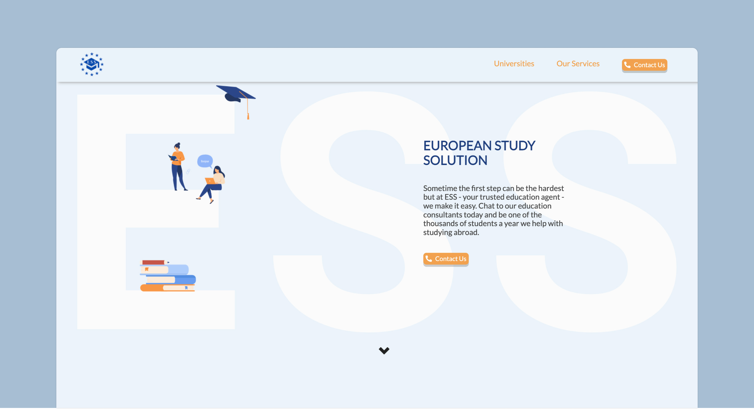
European Study Solution is a new start-up organization registered in Ukraine, whose purpose is to help American students with the application process and preparation for life abroad.
ESS would like to provide a payable service for Americans to help with application submission to European educational programs. The company’s main service feature is a unique approach to their client, where the main focus would lay on helping to find professional orientation, assistance with all the documentary work, preparation for life abroad, etc.
Problem
The main issue ESS is facing is that the company is missing an informative website with the necessary information, which would help students to choose them as a study agency. The website should contain all necessary information about available university programs, the application process, coming deadlines, service fees, and information about living abroad to make the website more attractive and useful to convince people to use the agency's service.
Objective
This must be achieved by creating the website from scratch, which would be the main information platform for the company, where they could have an overview of different services, prices, and information about universities available in France.
User Research
To get a better understanding of our users we had to conduct detailed research understand the environment they live in and observe their behaviors and habits
We proceeded with gathering data using qualitative user research where we conducted interviews using a closed question survey. For this we have created an interview guide with a categorization list, to set our target audience which in our case consisted of American students from 18-20 year-old or older, willing to study abroad and open to new cultures and experiences
Personas
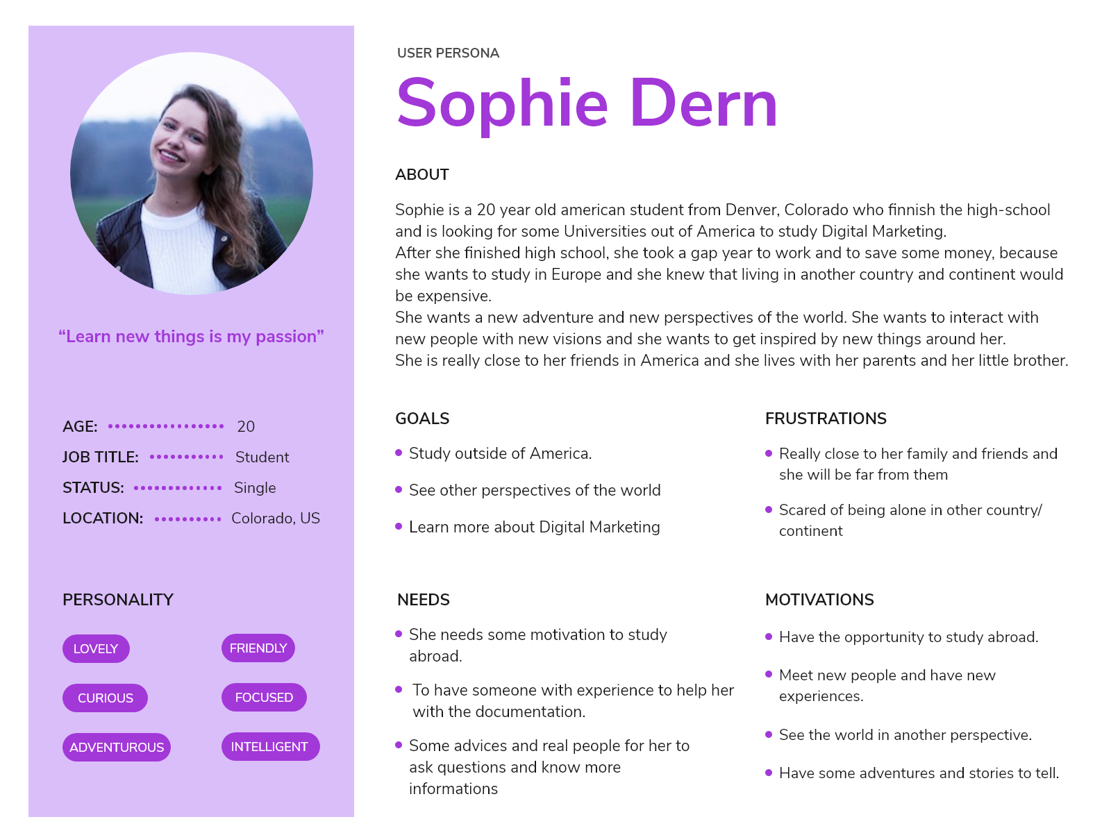
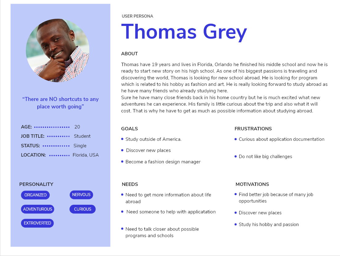
For further insight we created personas to understand our users needs and assume their experiences within a product, behavior and goals.
Five Plane
We carried out this product by utilizing the Five Planes Method.
 Strategy plane
We started with setting two key issues: what value should the website bring for the organization and what value it can bring for the user. Since the agency didn't have any website yet, it would be a core platform for them to attract potential customers, and for the users, it would be the main moderator between the agency and partner universities.
By answering these questions, it helped us to see that the website we will produce, will be more intended to use as an information website, with less functional specifications and more content requirements, hence spending more time on Information Architecture, to increase the content readability
 Scope Plane
We defined what are the required content elements to meet the users' needs, both from the functional and content requirement side.
 Structure Plane
After the requirements have been set, we got a clear picture of what will be included on the website. Besides adding new elements after meeting with our client, we revised the information architecture and created categories and navigational schemes that would allow users to move through the site content efficiently.
 Skeleton Plane
In this phase, we have already experimented with the very first wireframe, identifying specific aspects of the interface like navigation, placing the buttons, blocks of text, etc. On the structure plane, we looked at the larger-scale issues of architecture and interactions. In this phase, our concerns exist at a smaller scale of individual components and their relationship.
Information Architecture
The main purpose of our website was to interpret information for the users, by performing tasks with the least amount of effort possible contributing to an easy and natural experience. To truly accomplish this task, we of course also had to define the most relevant contents for the user.
Wireframing
As part of the skeleton phase, we have created the first design iterations - Wireframes. It gave us clear overview of the page structure and while represented the initial product concept, we kept styling, color, and graphics to the minimum.
We established the navigation bar where we included different page labels to emphasize the structure.

Besides, at the very beginning of the website, we had a similar vision of displaying a full-width picture or slide show gallery.
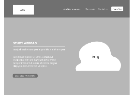
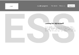
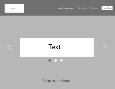
Since the landing page is what will catch the user's interest from the very second, therefore we made multiple different prototype, where we clarified what ESS is about and what service they provide, including the key points of their service.
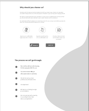
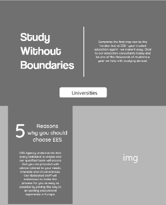
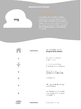
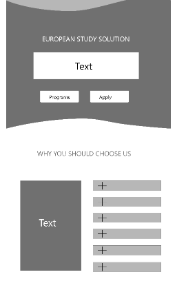
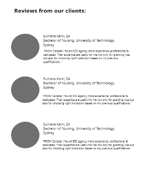
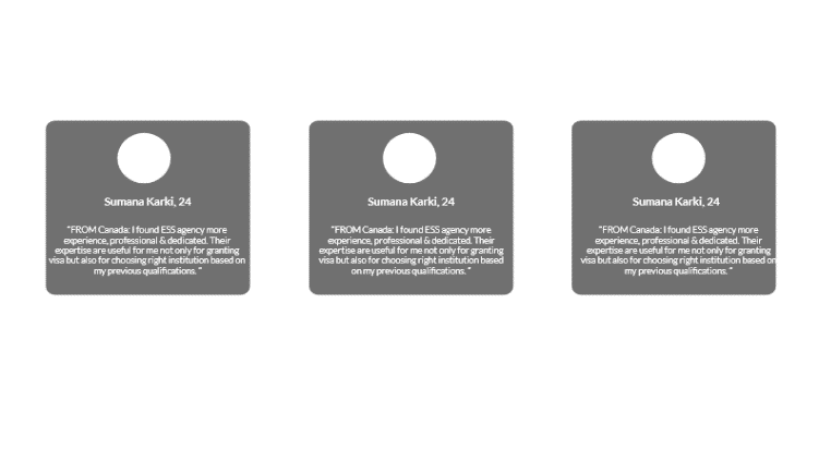
We considered implementing a section where the reviews of the company would be shown. Our idea was to display these as a card element in accordance with the Gestalt Principles.
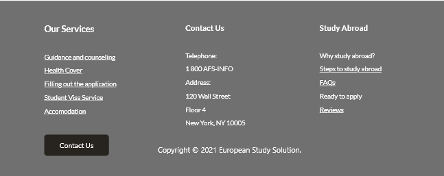
According to the footer design, we have tried to display the most important links from the website they should look for, if they missed it on the page, also the agency’s contact information.
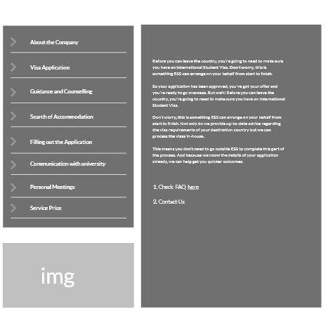
Moving to the service page, the most convenient solution we came up with is a vertical sidebar on the left with variety of tabs. On the right side, we placed a container with information, which can be changed by using the tabs
We placed a page for the universities, where content and visuals play an important role, therefore it was our task to make it informative, while being easily readable. Since we have different universities' information, we tried to make the layout template that should suit all of them.
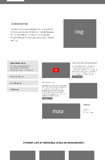
Lo‑Fi
Following additional client meetings, we showcased the partner universities on the landing page based on feedback. This inspired us to display them on the university page as well, whereby clicking on the icon of the institution, the content will change accordingly.
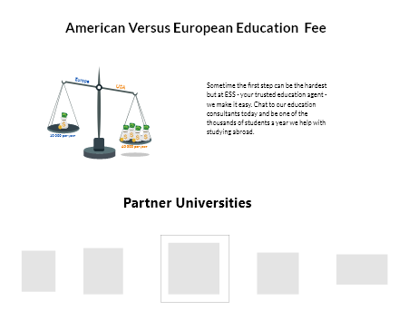
As a follow-up, we also placed a price scale, to highlight the advantage of using the service of our client by studying in European universities over Americans.
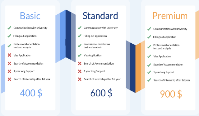
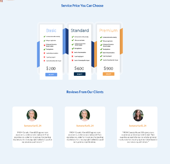
Moreover, we placed an implementation of service package prices and what included in them to help consumers find a deal suited for their needs.
Surface Plane

After making the structure of wireframes and elements that should be on the page, we reached the Surface Plane. Here we placed our attention to the sensory design to produce a finished design, where content, functionality and aesthetics came together.
Mockup
We have made the last iteration of combining our ideas, client wishes, and research to make the final product, with most of the necessary design assets and components.
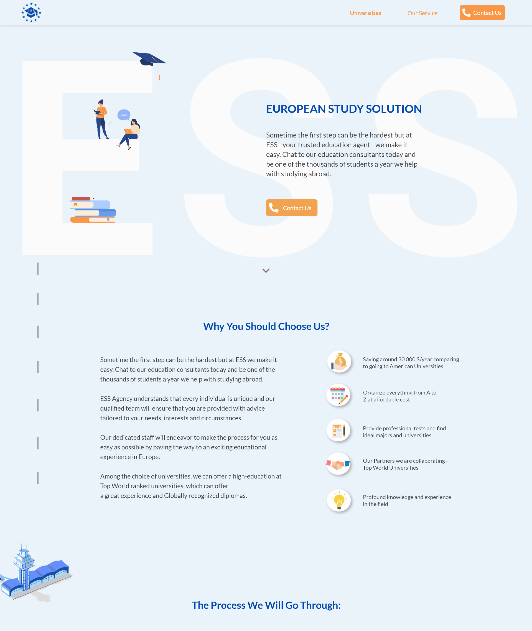
In the review section, we displayed place for 3 upcoming customer review, which in the future can be expanded with the use of a slide function.
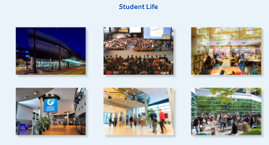
Reading plenty of text can result in fatigue. Placing pictures of the schools can uplift their mood and leave a cheerful impression on the users. Afterall, they sometimes speak more than words
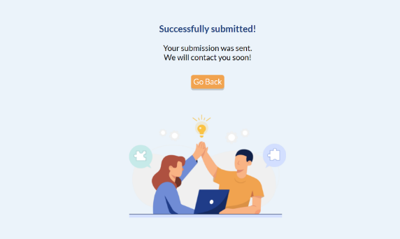
Lastly, but not least, the contact us page, provides is satisfying confirmation to eliminate any uncertainty if their application was submitted.
Responsive Design
Due to our target audience, making the website responsive was one of our highest priority. Consequently, we made prototypes for both tablet and mobile devices. This came with a responsive navigation via a hamburger menu.


Realization
After finishing our final design, or for our high-fidelity mockup, we started to code by using HTML, CSS and JavaScript.
Usability
To validate our design, we conducted a five-second test to view and observe the first impressions of our users and a Think Aloud test to make sure our product serves its purpose as intended.
The test was successful and concluded that the concept is well founded.
SEO
Lastly, we improved the website using metadata and further optimization to generate online traffic, driven by search engines so it can be properly indexed and displayed within the search results.

Summary
To conclude our process, we have created a website for the start-up organization - European Study Solution, which will be the main platform for them to develop their business and keep in contact with students in the future. From the user perspective, ewe create the possibility to know more about the agency and engage them to use the agency's services.
Overall, we feel we have created a content-rich and functional product that the user can utilize and receive the information and assistance they require regarding their journey abroad
